Serving Series Part 5: Identifying Suboptimal Shape
- Nov 25, 2022
- 4 min read
Updated: Feb 6, 2023
Previous post: Serving Series Part 4: Shaping Production
How do we use shape to make our athletes more productive? How do we know if an athlete’s production is shaped optimally? How do we know how an athlete’s production will change when we change the shape of production?
Once we understand what shape is, we need to discuss how to use it to make athletes more productive. Describing an athlete is not that useful for coaches, we need our stats to give us actionable prescriptions. In this post, I’ll discuss how shape can produce actionable information by identifying a suboptimal shape and the directionality of its flaws.
To identify a suboptimal shape, we will look for patterns in an athlete’s production that show a profitable tradeoff can be made. As an example, I’ll talk about Ace:Error ratio. We can use specific data about Ace:Error ratio and generalizations about what happens to shape as approach changes to prescribe a change in shape to an athlete or team.
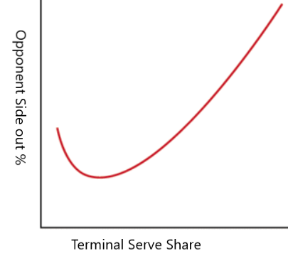
Recall from a previous post that aces and errors together are called terminal serves. Also recall from a previous post that as a server becomes more aggressive, terminal serves will make up a greater share of their total serves and terminal serves will become less efficient. Let’s make a graph that models that.

The small dip at the lower left portion of the graph is to reflect the intuition that there exists a serving approach so passive that as the server got more aggressive, their terminal serves would also become more efficient. But, the interesting part of the graph is when the terminal serves are becoming more frequent, but less efficient. How do we identify the optimal spot on the x-axis?
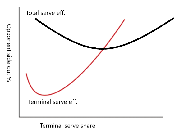
To find the optimal spot on the x-axis, and with it the optimal level of aggression, we need to add another line to our graph. When we plot total serving efficiency, we can find the minimum opponent side out percentage and then try to produce that outcome with our approach. This is what that looks like:

The important feature of this graph is that total serves are most efficient when they have the same efficiency as terminal serves. When terminal serves are more efficient than total serves, we should want to do them more often, even at the expense of making terminal serves less efficient. On the flip side, when terminal serves are less efficient, we should do them less often, to make them and the total more efficient. A feature that I appreciate about trying to match side out percentage on terminal serves and side out percentage on total serves is that its prescriptions match directionally the prescriptions I would make intuitively. Against a team in a situation where they don’t side out well, it tells you to be less aggressive. Against a team in a situation where they do side out well, it tells you to be more aggressive. This is at least directionally similar to the way we currently understand serving approach.
Let’s look at some concrete examples and talk about what this approach implies. For the first example, I’ll look at the team I currently coach, Earlham College’s varsity team. In the 2022 season, we had 188 aces and 160 errors, which is a 46% side out percentage on terminal serves. We gave up a total side out percentage of 56.5%. This means that we probably could have been more efficient by serving more aggressively. (It took some work to put this data together but it's doable from information that is public, I'll do a methods post about this at some point)
For the second example, I’ll look at Chad Gordon’s large sample of VolleyMetrics data. In this dataset, servers got an ace 77k times and made an error 126k times, which is a 62.1% side out percentage on terminal serves. They gave up a total side out percentage of 57.3%. This means that they probably could have been more efficient by serving less aggressively.
Perhaps my clickbaity title at the start of this series was inaccurate. I titled the first blog in this series “Your Team Needs to Miss More Serves,” when I guess it should have been “My team needs to miss more serves, your team needs to miss less.”
These two datasets are a little rough because they are team-level and environment-level data. I would love to have access to athlete-specific data to make more tailored prescriptions for athletes. One challenge to be aware of when looking at athlete-level data is achieving statistical power. When you have small datasets, the dataset often lacks statistical power. 10 or 20 or even 100 serves may not be enough of a sample to differentiate actionable information from statistical noise. I’ll talk more about statistical power in my next post when I talk more about athlete-level data, how to generate it, and how to use it to make prescriptions about shape for athletes. You can also Google statistical power yourself and you’ll pretty quickly know as much as I do.
Future post that calls back to this one: Serving Series 11: Why the Marginal Cost Graphs are a Lie


Comments