Serving Series Part 3: Serving Production and How to Measure It
- Nov 18, 2022
- 2 min read
Updated: Nov 25, 2022
From previous post: Serving Series Part 2: The All-or-Nothing Server:
"Servers are productive insofar as they contribute to scoring points. If we are more likely to score a point after the serve lands or after the first contact on the serve than we were at the start of the point, the server has been productive. If we are less likely, the server has hurt us."
Today we’ll talk about how servers are productive and about how to measure that production.
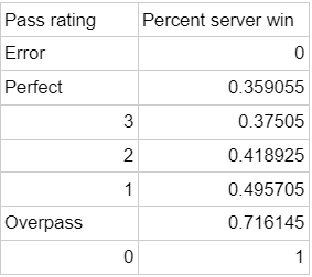
A potential misstep one could make in analyzing serve receive data is to use the traditional 3-2-1-0 pass rating system and average those to get a rating. These ratings are not appropriate to be averaged because the relative distances between them are not proportional to how they affect a team’s chances to win the point. Chad Gordon puts numbers to this phenomenon. He has them in eV form, this is how he describes that formula: “In this case, “rally_eff” is just saying, if a specific touch happens and you won that rally at any point, +1. If you lost that rally at any point -1. Then we aggregate all those attacks and divide by the count to determine the average rally_eff or average Expected Value.” For me, win probability is more intuitive to look at than eV numbers so I converted the eVs to win probabilities by calculating (eV+1)/2.

With these numbers that are proportional, we can see that 3 to 2 is much too large of a dropoff compared to their actual values, and that 1 to 0 is much too small of a dropoff compared to their actual values.
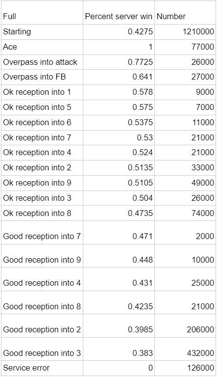
To get accurate relative values for serving outcomes, we return to Gordon’s blog. Gordon’s table from the link becomes this table for win probabilities.

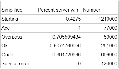
As you can see, the serving team won the point 42.75% of the time in the 1.21 million some-odd points in Gordon’s data set. Each other possible event is put in order of how often the serving team wins the point when that event follows the serve. I took this and made a simplified chart that has some less granular categories, which are helpful if you, like me, are unfamiliar with VolleyMetrics notation:

These three charts, depending on the rating system you like and how granular you want to get with the data, can tell you the relative values of various outcomes. These numbers are rough, they are aggregated from a large number of teams of varying levels so these numbers might be off from what your team should expect.
So, servers are productive when they improve their team’s chances to win a point. They do so by creating positive outcomes and avoiding negative ones. Those positive and negative outcomes have quantifiable value that, depending on the point-scoring environment, are roughly recorded in the tables in this post and on Gordon’s blog.
Next Post: Serving Series Part 4: Shaping Production


Comments